2024 · SaaS landing page
Social Media Marketing Agency
A concept landing page for an SMM panel service, pairing a gradient hero with a stepwise onboarding flow and pricing tiers.
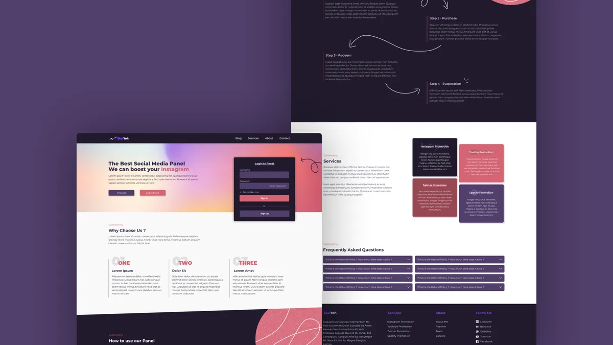
Overview
This is a self-initiated concept for an SMM panel landing page, the kind of service that resells social engagement to agencies and creators. The brief I set myself was to make something that felt confident rather than spammy, since most sites in this space lean heavily on neon gradients and stock testimonials. The deep purple canvas anchors the layout, while a single peach circle motif threads through the long scroll to keep the eye moving between the hero, the “How to use our Panel” steps, and the pricing block. The result reads more like a product launch page than a reseller dashboard.
Context
SMM panel sites tend to look interchangeable: dark backgrounds, generic icons, and dense feature lists. I wanted to use this exercise to push against that template while staying inside the visual cues the audience expects. The hero pairs a soft pink-to-orange gradient panel with a login card sitting directly on top, so a returning customer can sign in without scrolling. Below that, the layout shifts between dark and light sections to chunk the page into clear acts: value proposition, proof, onboarding, services, pricing, and FAQ.
Problem
The core challenge was reconciling two audiences on a single page. A first-time visitor needs a slow ramp that explains what an SMM panel even does, while a returning user needs a fast path to log in and top up. A flat hero serving both groups would have felt noisy. I also needed to make the four-step onboarding feel like a guided walkthrough rather than a checklist, since the hand-drawn arrows in the mock had to carry both decorative and instructional weight.
Approach
I split the hero into two zones: a marketing pitch on the left and a persistent login card on the right, so neither audience has to wait on the other. The “How to use our Panel” section uses dashed arrows hand-routed between four numbered cards, which gives the flow a sketched, human quality against the otherwise tight grid. Pricing is laid out as three contrasting cards with the middle tier raised in saturated pink to draw the default click. The peach circle motif appears in the hero, in the steps section, and again at the page foot to bookend the scroll.
Outcome
The final composition holds together as a single concept piece: one hero, one onboarding walkthrough, one services strip, one pricing block, and one FAQ accordion, all sharing a tight purple and peach palette. I treated the build as a Figma-first exercise and then translated the key sections into a Next.js prototype with Tailwind for layout and Framer Motion for the arrow reveals. Because it is a concept, there are no live conversion numbers to point at, but the layout decisions are documented well enough that I can lift the patterns into a future client brief.
Lessons
- Anchor a long scroll with one repeating shape instead of layering new motifs per section.
- Let the hero serve two audiences by splitting it into a pitch zone and a returning-user zone.
- Use hand-drawn arrows sparingly so they read as guidance rather than decoration.
- Raise the recommended pricing tier with colour, not just a badge, to set the default click.
- Treat self-initiated concepts as pattern libraries you can pull from on future client work.